2 Data Project Architecture
As a data scientist, you’re also a software developer, like it or not. But you’re probably not a very good software developer. I know I’m not.
For the most part, being a mediocre software developer is fine. Maybe your code is inefficient, but it’s not a big deal. The exception is that poorly-architected software is likely to break when you share it to collaborate or go to production.
So, in this chapter, I’ll share some guidelines about how to design your data science project so it won’t fall apart or have to be rebuilt when you take it to production.
Before we get to designing a data science project, let’s talk about a standard software architecture that’s also helpful for data science projects – the three-layer app.
A three-layer app is divided into (you guessed it) three layers:
- Presentation Layer – what the end users of the app directly interact with. It’s the displays, buttons, and functionality the user experiences.
- Processing Layer – the processing that happens as a result of user interactions. Sometimes, it is called the business logic.
- Data Layer – how and where the app stores and retrieves data.
You may also have heard the terms front end and back end. Front end usually refers to the presentation layer and back end to the processing and data layers.
Thinking about these three layers can help clarify the parts of your project. Still, a data science project differs enough from general-purpose software that you can’t just take three-layer best practices and graft them onto a data science project.
First, you may not be designing an app at all. Data science projects produce all kinds of different outputs. An app is one option, but maybe you’re creating a report, API, book, or paper.
Second, you’re designing a project, which is often not just an app. You likely have, or should have, several different components, like one or more ETL or modeling scripts.
Third, most general-purpose apps run in response to something users do. In contrast, many data science projects run in response to updates to the underlying data – either on a schedule or in response to a trigger.
Lastly, general-purpose software engineers usually get to design their data layers. You probably don’t. Your job is to extract meaning from raw input data, which means you’re beholden to whatever format that data shows up in.
Even with these differences, you need to make choices that, if made well, can make your app easier to take to production. Here are some guidelines I’ve found that make going to production easier.
Choose the right presentation layer
The presentation layer is the thing your users will consume. The data flows for your project will be dictated by your presentation layer choices, so you should start by figuring out the presentation layer for your project.
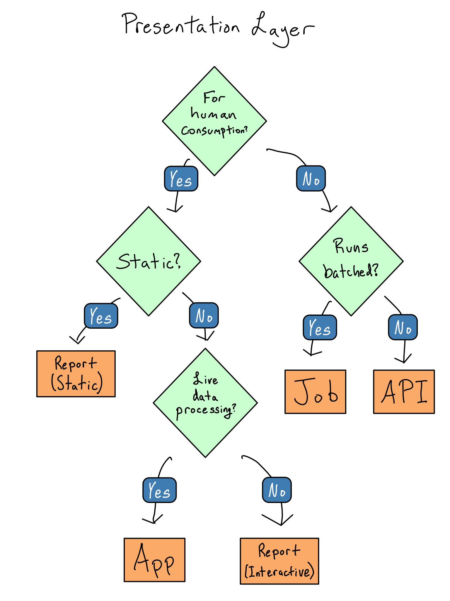
Basically, all data science projects fall into the following categories:
A job. A job matters because it changes something in another system. It might move data around, build a model, or produce plots, graphs, or numbers for a Microsoft Office report.
Frequently, jobs are written in a SQL-based pipelining tool (dbt has risen quickly in popularity) or in a
.Ror.pyscript.1 Depending on your organization, the people who write jobs may be called data engineers.An app. Data science apps are created in frameworks like Shiny (R or Python), Dash (Python), or Streamlit (Python). In contrast to general-purpose web apps, which are for all sorts of purposes, data science web apps are usually used to give non-coders a way to explore datasets and see data insights.
A report. Reports are code you’re turning into an output you care about – like a paper, book, presentation, or website. Reports result from rendering an R Markdown doc, Quarto doc, or Jupyter Notebook for people to consume on their computer, in print, or in a presentation. These docs may be completely static (this book is a Quarto doc) or have some interactive elements.2
An API (application programming interface). An API is for machine-to-machine communication. In general-purpose software, APIs are the backbone of how two distinct pieces of software communicate. In data science, APIs are mostly used to provide data feeds and on-demand predictions from machine learning models.
Choosing the right type of presentation layer will make designing the rest of your project much easier. Here are some guidelines on how to choose which one to use for your project.
If the results of your software are for machine-to-machine use, you’re thinking about a job or API. You should create a job if it runs in a batched way, i.e., you write a data file or results into a database. If you want results to be queried in real-time, it’s an API.
If your project is for humans to consume, you’re thinking about creating an app or report. Reports are great if you don’t need to do data processing that depends on user input, and apps are great if you do.
This flow chart illustrates how I decide which of the four types to build.
Do less in the presentation layer
Data scientists usually don’t do a great job separating out their presentation layers. It’s not uncommon to see apps or reports that are thousands of lines of code, with user interface (UI) components, code for plots, and data cleaning all mixed up together. These smushed up layers make it hard to reason about the code or to add testing or logging.
The only code that belongs in the presentation layer is code that shows something to the user or that collects input from the user. Creating the things shown to the user or doing anything with the interactions shouldn’t be in the presentation layer. These should be deferred to the processing layer.
Once you’ve identified what belongs in the processing layer, you should extract the code into functions that can be put in a package for easy documentation and testing and create scripts that do the processing.
Moving things out of the presentation layer is especially important if you’re writing a Shiny app. You want to use the presentation layer to do reactive things and move all non-reactive interactions into the processing layer.
Small data in the presentation layer
Everything is easy when your data is small. You can load it into your Python or R session as your code starts and never think about it again.
“Real engineers” may scoff at this pattern, but don’t let their criticism dissuade you. If your data size is small and your project performance is good enough, just read in all of your data and operate on it. Don’t over-complicate things. This pattern often works well into the range of millions of rows.
It may be the case that your data isn’t small – but not all large data is created equal.
Truly big data can’t fit into the memory on your computer all at once. As computer memory gets more plentiful, truly big data is getting rarer.
It’s much more common to encounter medium data. You can technically load it into memory, but it’s substantial enough that loading it all makes your project’s performance too slow.
Dealing with medium or big data requires being somewhat clever and adopting a design pattern appropriate for big data (more on that in a bit). But, being clever is hard.
Before you go ahead being clever, it’s worth asking a few questions that might let you treat your data as small.
Can You Pre-calculate Anything?
If your data is truly big, it’s big. But, if your data is medium-sized, the thing keeping it from being small isn’t some esoteric hardware issue, it’s performance.
An app requires high performance. Someone staring at their screen through a 90-second wait may think your project stinks depending on expectations.
But, if you can pre-calculate a lookup table of values or turn your app into a report that gets re-rendered on a schedule, you can turn large data into a small dataset in the presentation layer.
Talking to your users and figuring out what cuts of the data they care about can help you determine whether pre-calculation is feasible or whether you need to load all the data into the presentation layer.
Can You Reduce Data Granularity?
If you can pre-calculate results and you’re still hitting performance issues, it’s always worth asking if your data can get smaller.
Let’s think about a specific project to make this a little more straightforward.
Suppose you work for a large retailer and are responsible for creating a dashboard of weekly sales. Your input data is a dataset of every item sold at every store for years. This isn’t naturally small data.
But, you might be able to make the data small if you don’t need to allow the user to slice the data in too many different dimensions. Each additional dimension you allow multiplies the amount of data you need in the presentation layer.
For example, weekly sales at the department level only requires a lookup table as big as \(\text{number of weeks} * \text{number of stores} * \text{number of departments}\). Even with a lot of stores and a lot of departments, you’re probably still squarely in the small data category.
But, if you have to switch to a daily view, you multiply the amount of data you need by 7. If you break it out across 12 products, your data has to get 12 times bigger. And if you do both, it gets 84 times bigger. It’s not long before you’re back to a big data problem.
Talking with your users about the tradeoffs between app performance and the number of data dimensions they need can identify opportunities to exclude dimensions and reduce your data size.
Make big data small
The way to make big data small is to avoid pulling all the data into your Python or R session. Instead, you want to pull in only some of the data.
There are a few different ways you can avoid pulling all the data. This isn’t an exhaustive list; each pattern will only work for some projects, but adopting one or more can be helpful.
Push Work to the Data Source
In most cases, the most time-consuming step is transmitting the data from the data source to your project. So, as a general rule, you should do anything you can do before you pull the data out.
This works quite well when you’re creating simple summary statistics and when your database is reasonably fast. It may be unwise if your data source is slow or impossible if you’re doing complicated machine learning tasks on a database that only supports SQL.
Be Lazy with Data Pulls
As you’re pushing more work into the database, it’s also worth considering when the project pulls its data during its runtime. The most basic pattern is to include the data pull in the project setup in an eager pattern. This is often a good first cut at writing an app, as it’s much simpler than doing anything else.
If that turns out to be too slow, consider being lazy with your data pulls. In a lazy data pattern, you have a live connection to your data source and pull in only the data that’s needed when it’s needed.
If you don’t always need all the data, especially if the required data depends on what the user does inside a session, it might be worthwhile to pull only once the user interactions clarify what you need.
Sample the Data
It may be adequate to work on only a sample of the data for many tasks, especially machine learning ones. In some cases, like classification of highly imbalanced classes, it may be better to work on a sample rather than the whole dataset.
Sampling tends to work well when you’re trying to compute statistical attributes of your datasets. Computing averages or rates and creating machine learning models works just fine on samples of your data. Be careful to consider the statistical implications of sampling, especially remaining unbiased. You may also want to consider stratifying your sampling to ensure good representation across important dimensions.
Sampling doesn’t work well on counting tasks. It’s hard to count when you don’t have all the data!
Chunk and Pull
In some cases, there may be natural groups in your data. For example, in our retail dashboard example, it may be the case that we want to compute something by time frame, store, or product. In this case, you could pull just that chunk of the data, compute what you need, and move on to the next one.
Chunking works well for all kinds of tasks including building machine learning models and creating plots. The big requirement is that the groups are cleanly separable. When they are, this is an example of an embarrassingly parallel task, which you can easily parallelize in Python or R.
If you don’t have distinct chunks in your data, it’s pretty hard to chunk the data.
Choose location by update frequency
Where you store your data should be dictated by how often the data is updated. The simplest answer is to put it in the presentation bundle, the code and assets that comprise your presentation layer. For example, let’s say you’re building a simple Dash app, app.py.
You could create a project structure like this:
my-project/
|- app.py
|- data/
|  |- my_data.csv
|  |- my_model.pkl
This works well only if your data will be updated at the same cadence as the app or report itself. This works well if your project is something like an annual report that will be rewritten when you update the data.
But, if your data updates more frequently than your project code, you want to put the data outside the project bundle.
Filesystem
There are a few ways you can do this. The most basic is to put the data on a location in your filesystem that isn’t inside the app bundle.
But, when it comes to deployment, data on the filesystem can be complicated. You can use the same directory if you write and deploy your project on the same server. If not, you’ll need to worry about how to make sure that directory is also accessible on the server where you’re deploying your project.
Blob Storage or Pins
If you’re not going to store the flat file on the filesystem and you’re in the cloud, it’s most common to use blob storage. Blob storage allows you to store and recall things by name.3 Each of the major cloud providers has blob storage – Amazon Web Services (AWS) has S3 (short for simple storage service), Azure has Azure Blob Store, and Google has Google Storage.
The nice thing about blob storage is that it can be accessed from anywhere that can reach the internet. You can also control access using standard cloud identity management tooling.
There are packages in both R and Python for interacting with AWS that are very commonly used to access S3 – {boto3} in Python and {paws} in R.
The popular {pins} package in both R and Python wraps using blob storage into neater code. It can use a variety of storage back ends, including cloud blob storage, networked or cloud drives like Dropbox, Microsoft365 sites, and Posit Connect.
Google Sheets
If you’re still early in your project lifecycle, a can be a great way to save and recall a flat file. I wouldn’t recommend a Google Sheet as a permanent home for data, but it can be a good intermediate step while you’re still figuring out the right solution for your pipeline.
The primary weakness of a Google Sheet – that it’s editable by someone who logs in – can also be an asset if that’s something you need.
Store intermediate artifacts in the right format
As you break your processing layer into components, you’ll probably have intermediate artifacts like analysis datasets, models, and lookup tables to pass from one stage to the next.
If you’re producing rectangular data frames (or vectors) and you have write access to a database, use that.
But, you often don’t have write access to a database or have other sorts of artifacts that you need to save between steps and can’t go into a database, like machine learning models or rendered plots. In that case, you must choose how to store your data.
Flat Files
Flat files are data files that can be moved around just like any other file on your computer.
CSV
The most common flat file is a comma separated value (csv) file, which is just a literal text file of the values in your data with commas as separators.4 You could open it in a text editor and read it if you wanted to.
The advantage of .csvs is that they’re completely ubiquitous. Every programming language has some way to read in a .csv file and work with it.
On the downside, .csvs are completely uncompressed. That makes them quite large relative to other files and slow to read and write. Additionally, because .csvs aren’t language-specific, complicated data types may not be preserved when saving to .csv. For example, dates are often mangled in the roundtrip to a .csv file and back.
They also can only hold rectangular data, so if you’re trying to save a machine learning model, a .csv doesn’t make sense.
Pickle or RDS
R and Python have language-specific flat file types – pickle in Python and rds in R. These are nice because they include some compression and preserve data types when you save a data frame. They also can hold non-rectangular data, which can be great if you want to save a machine learning model.
DuckDB
If you don’t have a database but store rectangular data, you should strongly consider using DuckDB. It is an in-memory database that’s great for analytics use cases. In contrast to a standard database that runs its own live process, there’s no overhead for setting up DuckDB.
You just run it against flat files on disk (usually Parquet files), which you can move around like any other. And unlike a .csv, pickle, or rds file, a DuckDB is query-able, so you only load the data you need into memory.
It’s hard to stress how cool DuckDB is. Data sets that were big just a few years ago are now medium or even small.5
Create an API if you need it
In the case of a general-purpose three-layer app, it is almost always the case that the middle tier will be an API. Separating processing logic into functions is often sufficient in a data science app. But, separating it into an API is often helpful if you’ve got a long-running bit of business logic, like training an ML model.
You may have heard the term REST API or REST-ful.
REST is a set of architectural standards for how to build an API. An API that conforms to those standards is called REST-ful or a REST API.
If you’re using standard methods for constructing an API like R’s {plumber} package or {FastAPI} in Python, they will be REST-ful – or at least close enough for standard usage.
You can think of an API as a “function as a service”. That is, an API is just one or more functions, but instead of being called within the same process that your app is running or your report is processing, it will run in a completely separate process.
For example, let’s say you’ve got an app that allows users to feed in input data and then generate a model based on that data. If you generate the model inside the app, the user will have the experience of pressing the button to generate the model and having the app seize up on them while they’re waiting. Moreover, other app users will find themselves affected by this behavior.
If, instead, the button in the app ships the long-running process to a separate API, it allows you to think about scaling out the presentation layer separate from the business layer.
Luckily, if you’ve written functions for your app, turning them into an API is trivial since packages like {fastAPI} and {plumber} let you turn a function into an API by adding some specially formatted comments.
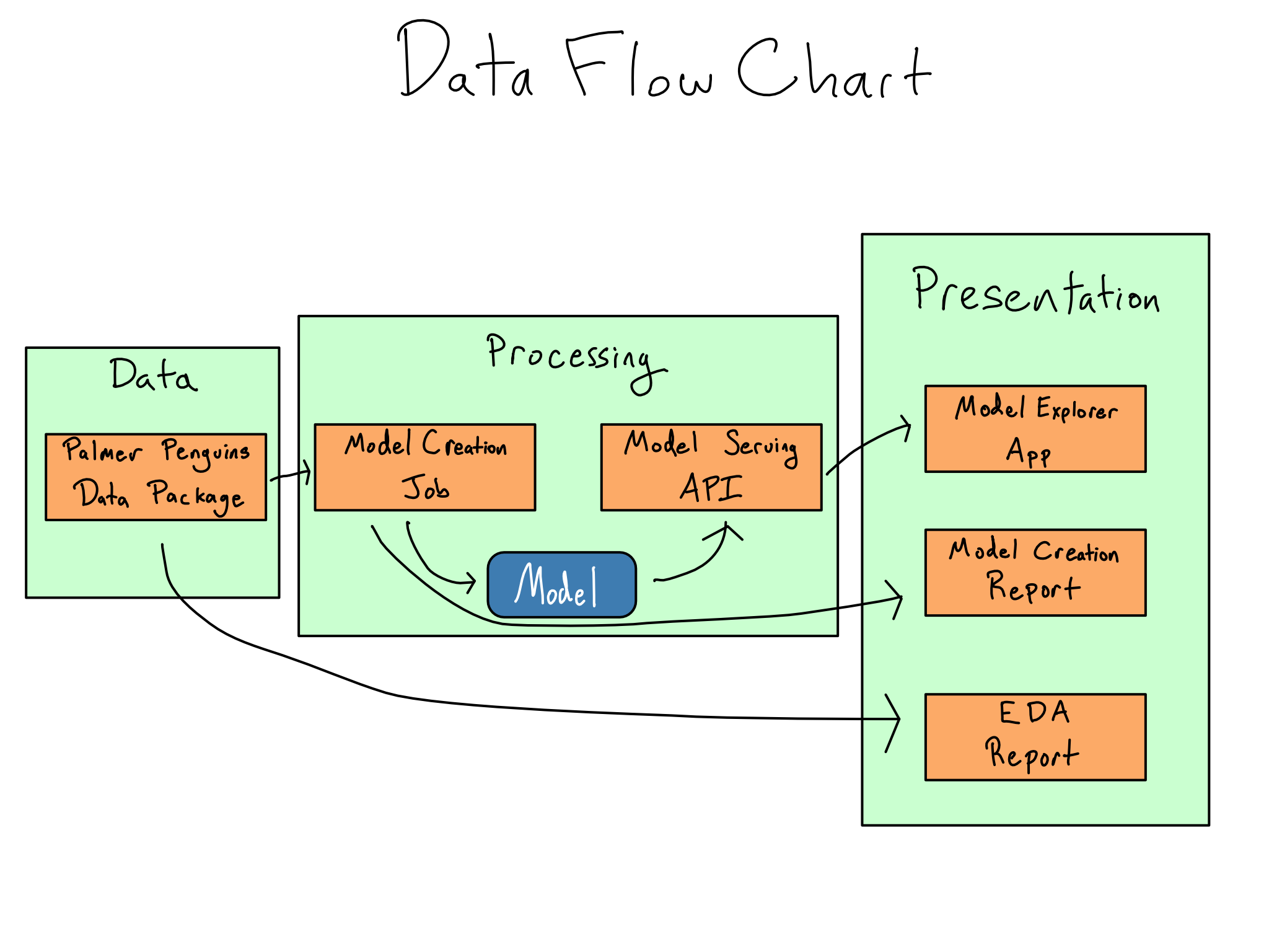
Write a data flow chart
Once you’ve figured out the project architecture you need, writing a data flow chart can be helpful.
A data flow chart maps the different project components into the project’s three parts and documents all the intermediate artifacts you’re creating along the way.
Once you’ve mapped your project, figuring out where the data should live and in what format will be much simpler.
For example, here’s a simple data flow chart for the labs in this book. You may want to annotate your data flow charts with other attributes like data types, update frequencies, and where data objects live.
Comprehension questions
- What are the layers of a three-layer application architecture? What libraries could you use to implement a three-layer architecture in R or Python?
- What are some questions you should explore to reduce the data requirements for your project?
- What are some patterns you can use to make big data smaller?
- Where can you put intermediate artifacts in a data science project?
- What does it mean to “take data out of the bundle”?
Lab: Build the processing layer
In Chapter 1, we did some exploratory data analysis (EDA) of the Palmer Penguins dataset and built an ML model. In this lab, we will take that work we did and turn it into the actual presentation layer for our project.
Step 1: Write the model outside the bundle
When we originally wrote our model.qmd script, we didn’t save the model at all. Our model will likely be updated more frequently than our app, so let’s update model.qmd to save the model outside the bundle.
For now, I’d recommend using the {vetiver} package to store it in the /data/model directory.
Once you follow the directions on the {vetiver} package website to create a {vetiver} model, v, you can save it to a local directory with
model.qmd
from pins import board_folder
from vetiver import vetiver_pin_write

model_board = board_folder(
  "/data/model",
  allow_pickle_read = True
)
vetiver_pin_write(model_board, v)
If /data/model doesn’t exist on your machine, you can create it or use a directory that does exist.
You can integrate this new code into your existing model.qmd, or you can use the one in the GitHub repo for this book (akgold/do4ds) in the _labs/lab2 directory.
Step 2: Create an API for model predictions
I’ll serve the model from an API to allow for real-time predictions.
You can use {vetiver} to autogenerate an API for serving model predictions. In Python, the code to generate the API is just:
app = VetiverAPI(v, check_prototype = True)You can run this in your Python session with app.run(port = 8080). You can then access run your model API by navigating to http://localhost:8080 in your browser.
If you want to spend some time learning about APIs, you also could build your own {FastAPI}. Here’s some code to get the model back from the pin you saved:
b = pins.board_folder('/data/model', allow_pickle_read = True)
v = VetiverModel.from_pin(b, 'penguin_model')
Though I’ll argue in Chapter 4 that you should always use a literate programming tool like Quarto, R Markdown, or Jupyter Notebook.↩︎
Exactly how much interactivity turns a report into an app is completely subjective. I generally think the distinction is whether there’s a running R or Python process in the background, but it’s not a particularly sharp line.↩︎
The term “blob” is great to describe the thing you’re saving in blob storage. Even better, it’s actually an abbreviation for binary large object! Very clever, in my opinion.↩︎
There are other delimitors you can use. Tab-separated value files (tsv) are something you’ll see occasionally.↩︎
Some people use SQLite in a similar way, but DuckDB is much more optimized for analytics purposes.↩︎